
UX & UI: Cut the fat #01 - Pinterest
New Series
Welcome to the new User Experience (UX) / User Interface (UI) series about trimming the fat from the digital world. By fat, I refer to any issue in regards to user experience or user interface inconsistency in the digital world that should not be there.
UX/UI inconsistencies and issues can be anything from one too many steps to perform a simple task or action to bad and inconsistent layout design.
This series will endeavour to point these issues out in order to raise awareness and build an archive of things-not-to-do-in-UX/UI. To make the series relatable to more people, I will try to keep it focused on more popular mainstream type webpages, services and apps.
I believe strongly that UX/UI needs to be continually worked on and iterated, and that this process should live on as long as the product or service is around.
Please feel free to add your thoughts or questions to the comments section below. I am also open to help and submissions for anything you could contribute to this series. Submissions to contact@itchban.com or in our About page.
“Perferction is finally attained not when there is no longer anything to add, but when there is no longer anything to take away.”
The first culprit for the cut the fat series is the popular web bookmarking service Pinterest. While I love this service and use it regularly, there are a bunch of inconsistencies which detract from it's user experience. It's core competency is allowing users to "Pin" images with it's associated URL, to create a visual bookmarking system of sorts.
WHY SO MANY CLICKS PINTEREST??
When adding pins to a board on the Pinterest.com website, I have found that there are too many unnecessary steps (in the form of clicks) to do so. Pinning images is the core function of the service and it is in Pinterests best interest to make this as easy and painless as possible.
Task: Pinning an Image from your computer (and adding an accompanying URL)
If you watch the video I have uploaded above, you'll notice that there is a grand total of 12 mouse clicks just to upload a single Pin to a board; and that's starting from the actual board I'm pinning to.
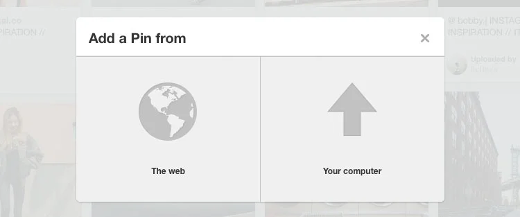
- Click which board to add Pin to
- Click Add a Pin
- Click Add a Pin from Your computer
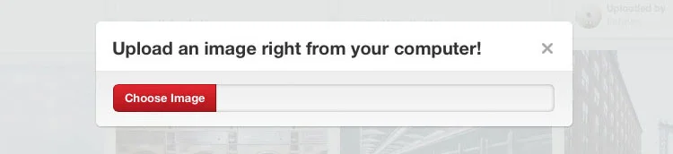
- Click Choose Image button
- Click to select image
- Click Choose button
- Click to type in the Description box
- Click the Pin It button
- Click to close the See It Now notification box
- Click to edit Image/Pin
- Click the URL Source input box
- Click Save Changes
That is just far too many clicks to Pin an image and attach a URL to it. Which clicks are unnecessary and can be removed without effecting the function?
Solution
CLICK 3 Upload a pin from The Web or Your Computer
Click 4 What is this prompt even for?
Click 4 is completely unnecessary. When selecting where to add the Pin from (The Web or Your Computer) in click 3 you have already chosen your computer. There is no need for it to prompt you to Choose Image again.
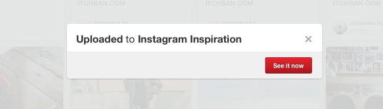
Click 9 Notification prompt that halts the entire uploading process
Click 9. Although the notification box auto closes after a few seconds, I feel it slows down the whole process too much. There are less obtrusive ways to inform the user that the upload was successful without halting the whole process entirely. A smaller notification in a screen corner would suffice.
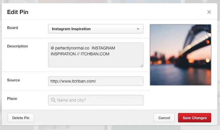
Clicks 10-12 - should have just provided this input box first off.
Clicks 10-12. These three steps are completely avoidable simply by putting a URL input bar when the user is initially Pinning the image (see above) Click 7. I realise that Pinterest is trying to minimise unauthentic and unrelated URLs being attached to Pins by discouraging manual URL input, but they allow it to happen anyway.
By removing these button clicks, Pinterest can slim the entire process down to 7 from a whopping 12 clicks. UX & UI professionals know the feels!
Afterword
I realise that to some of you (especially those who don't work in the industry), this may seem like nit picking and a little OCD. The suggested changes above aren't even big service halting changes, they're things that should not have been overlooked in the first place.
Every single little detail matters, and should not be overlooked when designing the user experience and UI. The devil is in the details, and if you realise the scale of users that systems like this are meant to service, you'll quickly be able to quantify the total time users have wasted.
I believe it is the culmination of small (and larger) issues like this which have contributed to the reason of why Pinterest is failing to transition from a popular hobbyist service into one of the tech scenes heavy hitters. Pinterest has so much potential, but currently, I feel they are stagnating, misdirected and not moving with enough much needed haste.
Pinterest, hire me, lol.
PERMISSION TO REPUBLISH:
ORIGINAL CONTENT. If you wish to quote, excerpt, or republish this article or any content contained within, please refer to the Terms of Use page for guidelines and gain expressed permission before doing so. You can contact me at: contact@itchban.com or through the contact forms found in the Terms of Use and About Us pages.


A collection of my favourite images right now.